Mercury is an easy-to-use email application that allows users to view and manage multiple email accounts in one place. The app was designed for Android Tablet. This project was assigned for the Digital Compositing course and was made in collaboration with Marta Nikitina
Many people check their email on mobile device, before they read it on their desktop. With today's incessant amount of email marketing, and most of professional communication being done by email, checking inboxes can sometimes be overwhelming. This often means that users have multiple accounts for multiple purposes. It can be great for routing emails that are not important, but it means that there are more accounts to check.
Furthermore, we found from speaking to several users that composing email on a mobile or tablet device can be highly frustrating when one factors in the lack of space there is to read and write comfortably.
The goal of this project is to make the experience of reading and composing email on tablet, more efficient and comfortable.
Mercury seeks to make checking emails easy by making it easy to merge different email accounts into one easy-to-use application. While also allowing easy navigation between the accounts.
Mercury also seeks to create a more comfortable space to compose and read emails, in which the user can forcuz solely on the task, without being hindered by lack of space.
Our design was formed with the concepts of easy accessability. The inbox shows a sidebar, which gives easy access to all folders and accounts.
The when composing an email, the screen will have a sidebar for recipient information and attachments. We made this bar retractable, so that users would have space to compose more comfortably.
The earliest version of our design included personalized color settings, and a calendar. As we started to design, we realized we had to focus on the main functionalities of the app to make a prototype that addressed the main challenges that users were facing.


We did two round of user testing, six user scenarios in total. One of the main scenarios was composing an email and attaching a file.
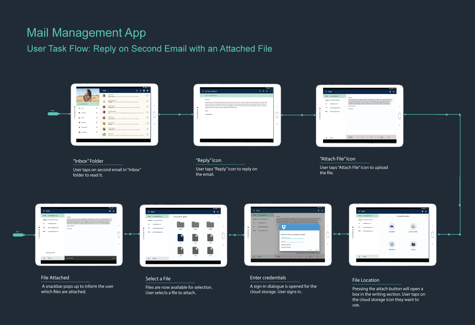
The first round revealed some flaws in the prototype. You can take a look below and see ome of the issues that the user had when completing this task.